I wish I had a designer’s eye. I envy people who can take a tired graphic and turn it into something fresh and exciting. And while my strengths will always lie with words, I can borrow a few tricks from designers to elevate my presentation design, especially when it comes to choosing a color palette. And you can too.
One of the things that makes presentation media stand out is a great color palette. So today, we’ll be looking at how to find color inspiration, and in our blog tomorrow, we’ll cover some tips on how to use it.
Where to Look for Color Inspiration
As writer for Gravit Designer Claudia Driemeyer says, “It’s easy to raise an average design to an awesome composition with just the right colors. On the other hand, looking at a color wheel with so many possibilities, creating a palette, even with just two colors, can be really intimidating.”
The last thing you want to do is to sit down at your computer and just start picking colors randomly. Instead, think about the presentation or company you are designing for. What is the theme or topic? What is the mood you want to create? How can color become part of the communication? Once you’ve taken some time to answer these questions, use one of the following tools to begin building your palette.
Canva
One of my favorite places to find color inspiration is at Canva. They have a page dedicated to color palettes and you can find it here.
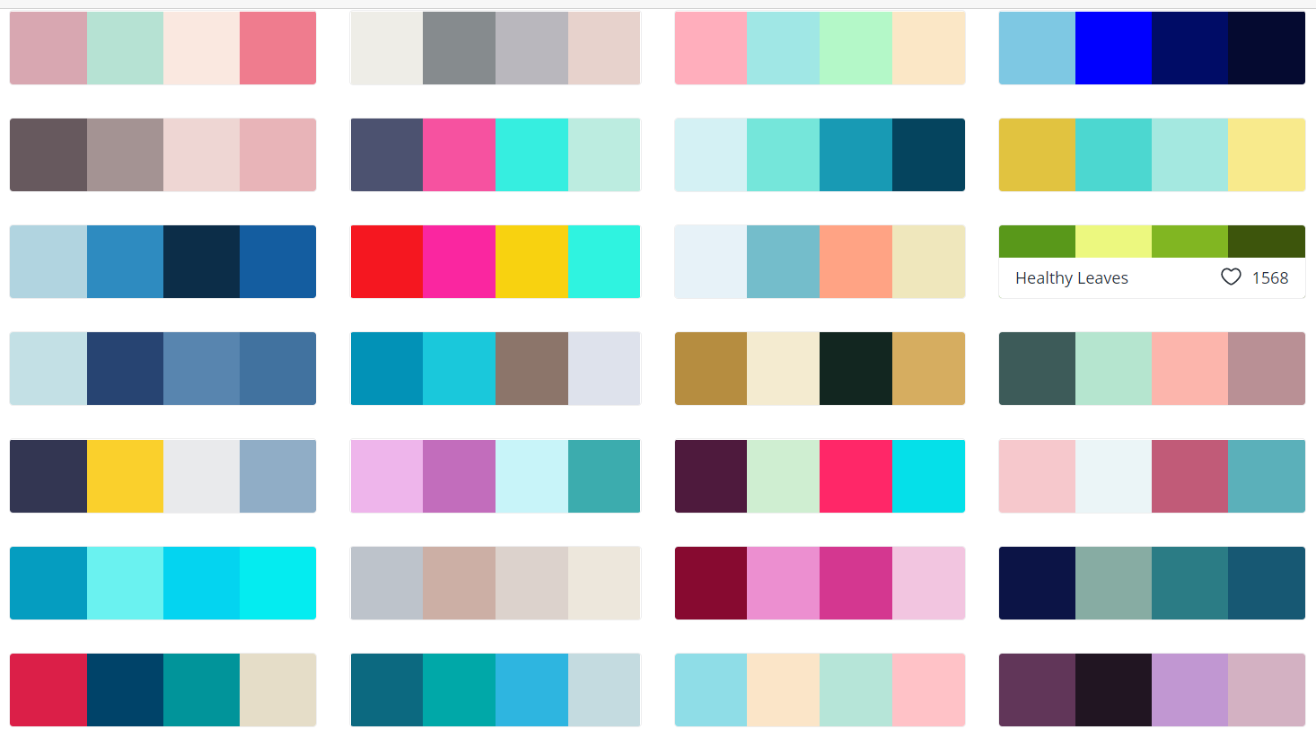
You can click on any of the collections that appeal to you and it will take you a second page where you can see how that palette might be used. Like this:
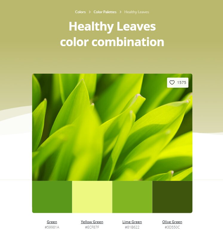
The specific color codes are listed below each color which makes them easier to find and use.
Adobe Color
Adobe Color is another great source for building a color palette. Here’s why. Adobe Color allows you to choose what kind of palette you want to create (monochromatic, triad, custom, etc.) on the left menu. This makes choosing colors easier, because it locks you into pre-determined patterns that are known to be aesthetically pleasing. (That is, unless you chose the “custom” option.)
But the benefits of this site don’t end there. You can also name and save the color palettes you create. And with just one click of the theme switch button (look for the moon/sun) on the upper right menu bar, you can switch from a white background to a dark background to see how your palette translates. You also have options to “explore” and research “trends” on the center top of the menu. Which takes you to more color inspiration by genre (fashion, graphic design, architecture, etc.).
Take Inspiration From Everyday Life
Say you are visiting a restaurant or a store that has great design and merchandising and you want to copy the color palette. Or you see a flower or sunset that inspires you. You can snap a picture on your phone and use an app to pull the colors you like from that picture. Apps like Pixel Picker and Pantone Studio make it quick and easy to upload photos and pull specific colors from them.
Designer Callie Hegstrom says this is a “great way to match text or graphics with any phot you’re working with to make sure your work is cohesive.” In other words, if you have specific images that have to be in your presentation, you might want to build your palette around the colors in those images.
The reason color choices are sometimes intimidating is because we think we are all alone when it comes to choosing them. As with anything else, there are resources and research and experts we can pull from to make smart decisions about color.
Want more help with color, presentation design, or public speaking? Get in touch with one of our experts now.
